Papello’s Design Studio provides an array of professional tools natively inside your web dashboard. This article explores the precise functionality of each toolbar option and option drawer so you can maximise your workflow configuration.
1. Initialising and Dimension Scaling
When you click "New Design," the interface triggers a modal window to choose your product variation. You can search by specific product categories like Enhanced Archival Matte Posters, Spiral Notebooks, Jogsaws, or Mugs.
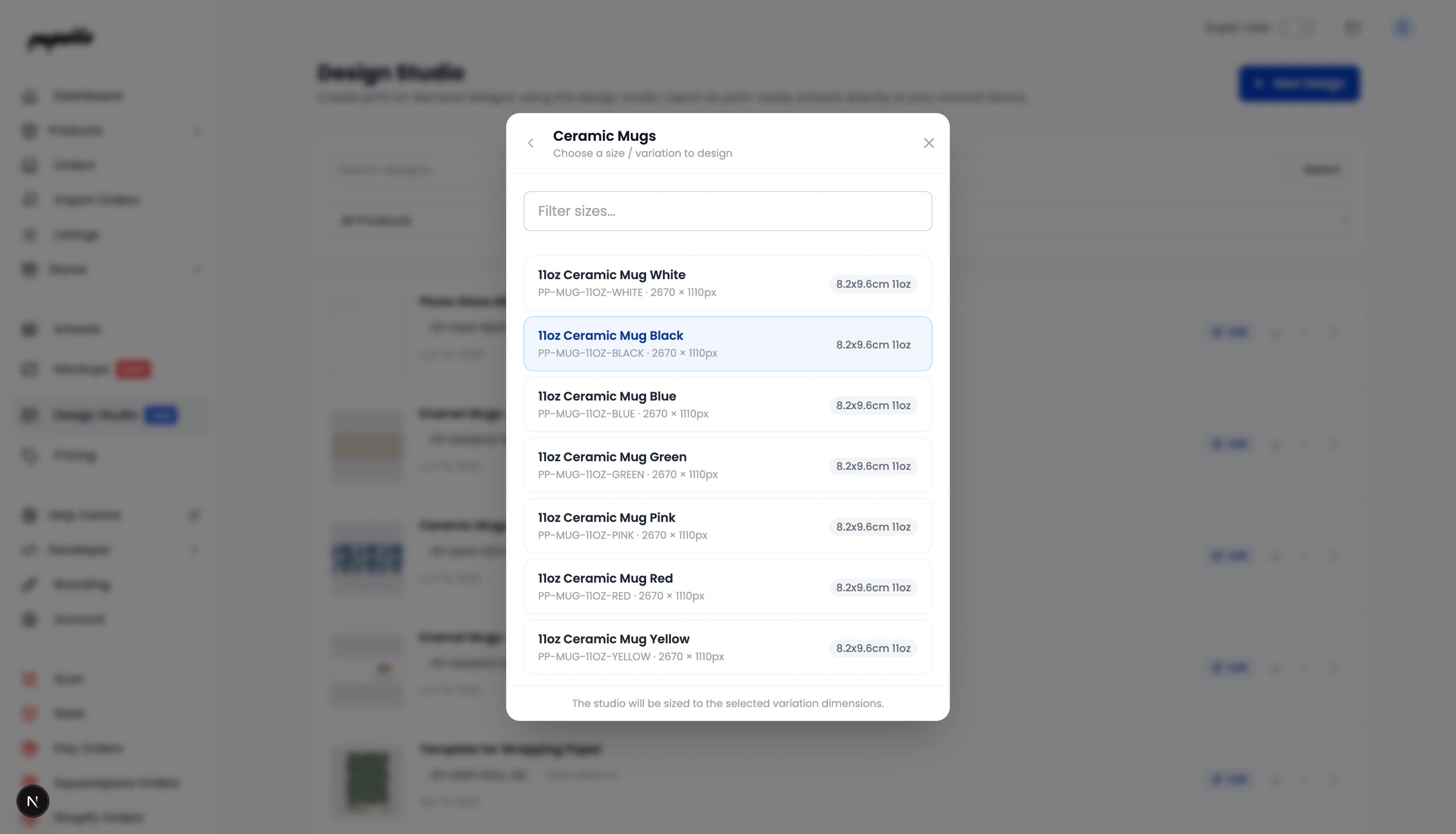
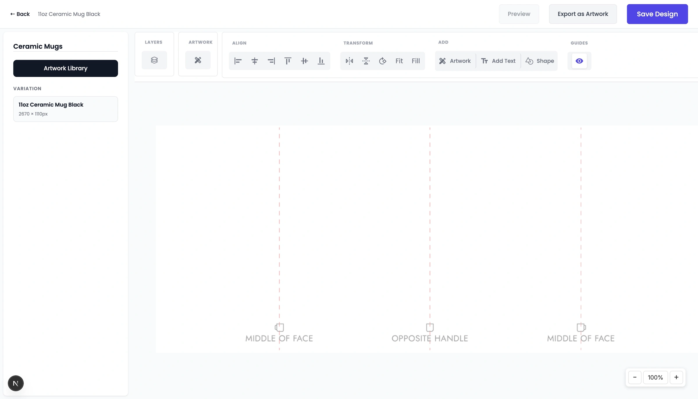
This choice sets your artboard to the print dimensions required for that variation (for example, the 11oz Ceramic Mug Black canvas initiates at precisely 2670 × 1110px). Depending on the product and variation you may see a positioning guide to help you correct place objects on the print areas, such as Middle of Face and Opposite Handle etc.
2. The Main Toolbar at the Top
The toolbar at the top of your screen holds all your main editing tools. Here is what each section does:
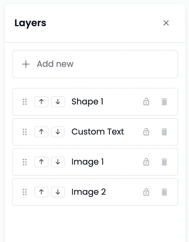
Layers Panel: This controls the order of the objects on your canvas. If you have text sitting behind an image, you can open this panel and drag the text layer to the top so it sits on front.
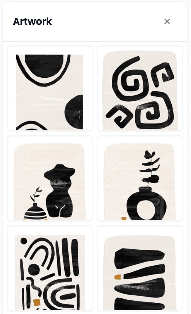
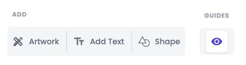
Artwork Drawer: This opens up your personal Artwork Library. Clicking it slides out a tray on the left side of your screen where you can click on any uploaded image to add it to your design.
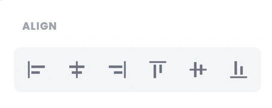
Align Tools: These allow you to instantly snap your images or text to the perfect position. You can align items to the left, center, right, top, middle, or bottom of your canvas with one click.
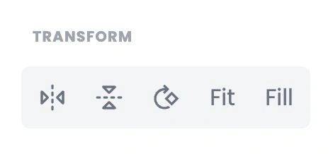
Transform Tools: These let you flip your images quickly:
Flip horizontally (left-to-right mirror image)
Flip vertically (upside down)
Rotate your images by degrees
Fit: Automatically stretches your image as large as possible while keeping the whole picture visible on the canvas.
Fill: Automatically stretches your image to completely cover the canvas from edge to edge, including the bleed areas.
Add Elements & Guides: These buttons let you instantly add a new artwork, a text box, or custom shapes. The Guides button (the eye icon) lets you hide or show the printing alignment lines whenever you want.
3. Adding and Editing Your Images
When you click an image from your library to add it to your canvas, a blue box with adjustment handles will appear around it.
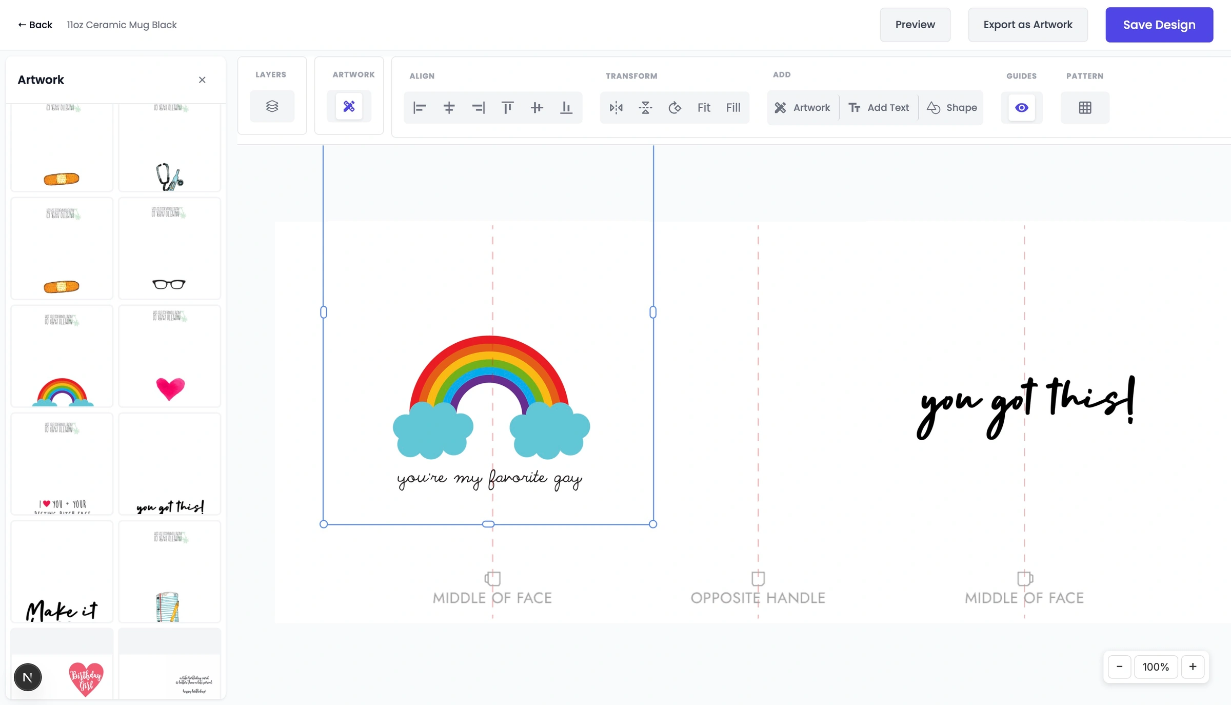
You can drag the corners of the box to resize or rotate the image freely.
Creating Repeating Patterns
Creating repeating designs for items like wrapping paper, notebooks, or mugs is incredibly easy with the Pattern tool. Instead of manually copying and pasting your artwork dozens of times, you can turn any single image into a seamless repeating pattern with just one click.
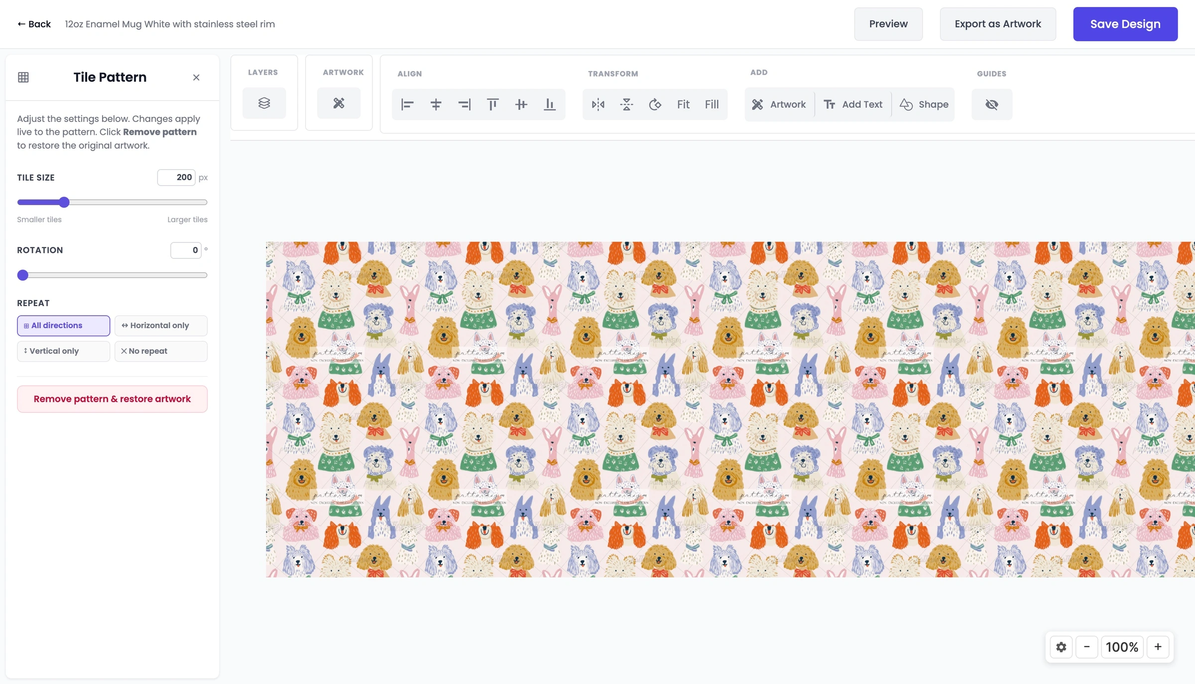
Opening the Tile Pattern Menu
When you select an image on your canvas and click the Pattern utility from the top toolbar, the left-hand panel transforms into the Tile Pattern settings menu. Any changes you make here will apply live to your canvas instantly.
Customising Your Pattern
The pattern panel gives you total control over how your image repeats across the product:
Tile Size: Use this slider to control how large or small your repeating images are. You can slide left for "Smaller tiles" to create a dense grid, or slide right for "Larger tiles". You can also type an exact pixel value (like
200 px) straight into the box for precision.Rotation: Want your pattern to repeat at a quirky angle? Use the rotation slider or type in a specific degree (from
0°up to360°) to tilt your tiles across the canvas.Repeat Directions: Choose exactly how you want the pattern to flow:
All directions: Fills the entire canvas horizontally and vertically like a grid.
Horizontal only: Repeats the image in a single row from left to right.
Vertical only: Repeats the image in a single column from top to bottom.
No repeat: Reverts the image back to a single standalone object.
Removing a Pattern
If you change your mind or want to try a different layout, you don't need to delete your image and start over. Simply click the red "Remove pattern & restore artwork" button at the bottom of the panel. This will instantly convert your design back into the single original image you started with.
4. Customising Your Text
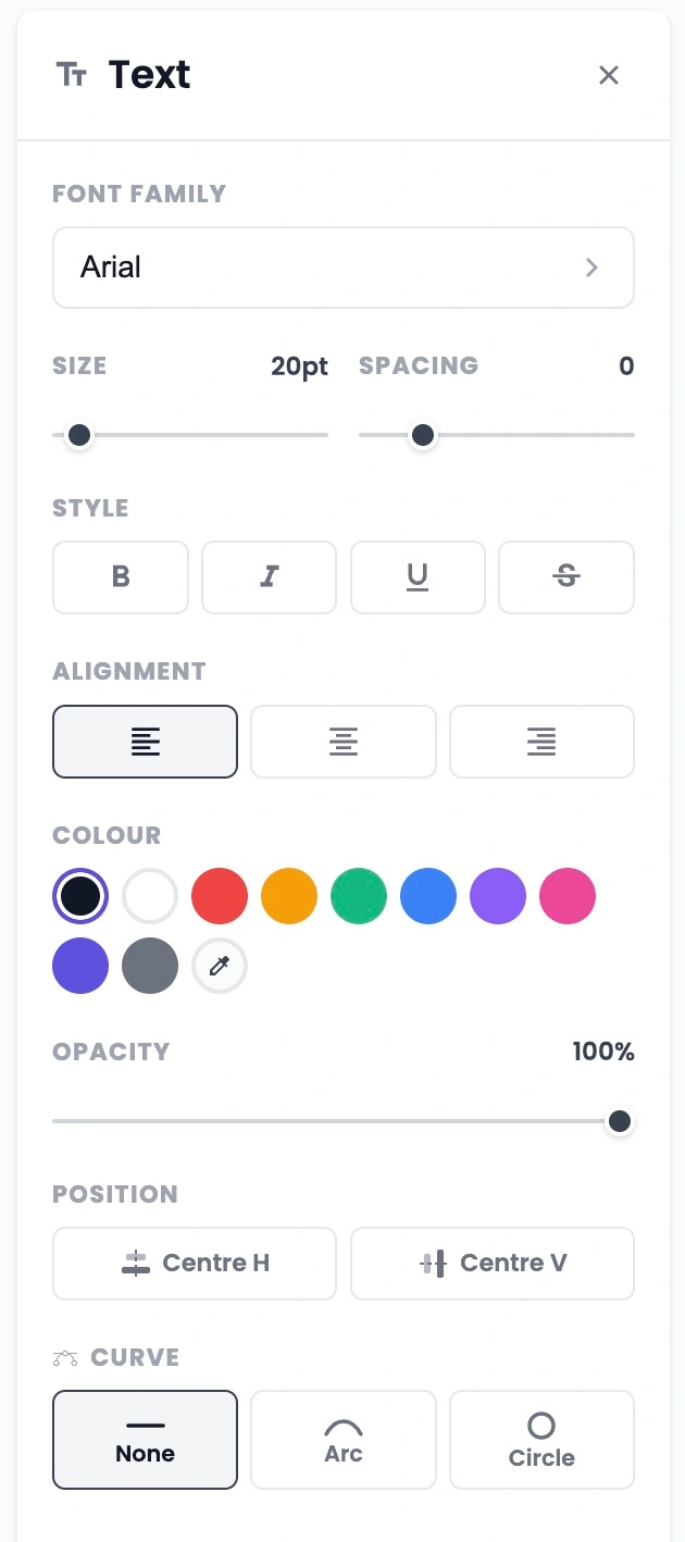
When you click the Add Text button, the left side of your screen changes into an easy-to-use text editing panel.

Here are the text adjustments you can make:
Font Families: Click the font drop-down menu to see a list of popular font styles. You can choose clean, standard fonts like Roboto, Open Sans, or Poppins, or choose fun, bold fonts like Luckiest Guy.
Size and Spacing:
Size Slider: Makes your text larger or smaller (from a subtle 20pt up to a bold 52pt).
Spacing Slider: Changes the horizontal gap between individual letters to give your text a more spacious or compact look.
Opacity: A simple slider that lets you make your text see-through, from a faint fade (0%) to fully solid text (100%).
Curve Tools: This exciting feature lets you change your text from a straight line into fun, creative paths:
None: Standard straight-line text.
Arc: Bends your text along a curve using a Curvature slider. You can slide it down to curve like a Bowl, or slide it up to curve like an Arch.
Circle: Warps your text so it wraps all the way around in a perfect 360-degree circle.
5.How to Use the Shapes Tool
Adding vector elements to your product designs is simple with the Shapes tool. Whether you need a solid background block, a stylish border frame, or a fun accent graphic, this tool provides full creative control directly within the dashboard.
Adding a Shape
Clicking the Shape button in the top toolbar opens the dedicated left-hand setup panel. You can instantly drop an element onto your canvas by selecting one of our preset options:
Square
Rect (Rectangle)
Circle
Heart
Star
Customising Your Shapes
Once a shape is on your artboard, you can completely change its look using our styling settings:
Fill Colour: Choose the main body colour of your shape from the preset palette options, or choose a transparent fill option if you just want to create an open border outline.
Stroke Colour: Control the outer border of the shape. You can pick a contrasting colour to make your shapes pop or use the red diagonal line icon to turn the stroke off entirely.
Stroke Width: Drag this slider to make your border lines as thick or thin as you like. It updates dynamically from
0pxupwards.Opacity: Want your shapes to be semi-see-through? Adjust this slider away from
100%to fade your shape out, allowing text or photos to show beautifully through it.
Wrap Up
Papello's Design Studio combines all these flexible image, text, pattern, and shape tools into one seamless dashboard experience. By taking advantage of these built-in design features, you can quickly build out high-resolution, print-ready product catalogs without ever having to leave your web browser or pay for expensive third-party graphic editing suites. Experiment with layering different combinations of typography and shape masks today to find a distinctive style that resonates with your customers!