
One of the most common challenges in print-on-demand is understanding why a design on a digital display does not always look identical once printed onto paper. If you have ever chosen a bright, glowing hex code on your monitor and noticed it looks slightly deeper or less intense on physical media, this guide explains the science behind that difference and how to set accurate expectations.
Light vs. Ink: RGB vs. CMYK
The primary reason for colour discrepancies lies in how screens and printers create light and shade:
Digital Displays (RGB): Monitors, laptops, and smartphones create colours using additive light (Red, Green, Blue). Because screens emit light directly into your eyes, they can reproduce extremely neon, backlit, and vivid shades (such as fluorescent greens, electric blues, and vivid hot pinks).
Physical Print (CMYK / Ink): Printers create colour using subtractive light (Cyan, Magenta, Yellow, Key/Black). Paper does not emit light; it reflects ambient light. Because inks absorb light rather than emit it, physical print has a smaller "colour gamut" (range of reproducible colours) than a digital screen.
Feature | Digital Screens (RGB) | Physical Print (CMYK / Giclée) |
Colour Source | Emitted light (Pixels) | Reflected light (Inks on paper) |
Colour Space | Broad RGB gamut | CMYK / Expanded Ink Gamut |
Speciality | Bright neons, backlit glow, high saturation | Rich tones, subtle gradients, tactile depth |
Reproducibility | High vibrancy on displays | Subject to ink absorption & paper profile |
Key Takeaway: Exact digital hex codes for neon or backlit RGB shades cannot be printed 1:1 on physical paper because paper lacks a backlight. Extremely bright RGB hex codes will automatically convert to the closest achievable physical ink shade.
Screen vs. Print Expectations
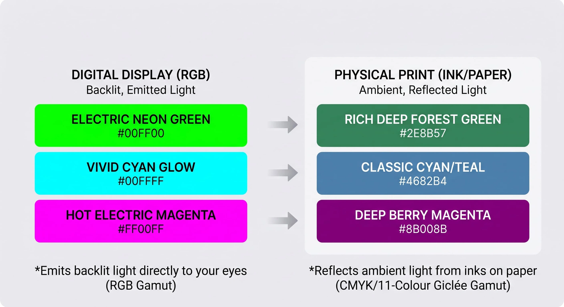
Hex Color Swatch Mapping
To show the realistic shift from screen pixels to printed ink, set up your side-by-side color blocks with these exact values:
Color Family | Screen Color (RGB Swatch) | Printed Reality (Ink Equivalent Swatch) |
Neon Green |
|
|
Vivid Cyan |
|
|
Electric Magenta |
|
|
How Paper Stock Alters Colour Output
The material your design is printed on plays an enormous role in the final visual outcome. At Papello, we print across three distinct material categories Cotton, Alpha-Cellulose (Fibre), and Standard Paper each reacting differently to ink absorption.
Gloss & Satin vs. Matte Finishes
Gloss & Satin Papers: Inks sit on top of the coated surface rather than sinking deep into the fibres. This reflects light directly back, creating higher contrast, deeper blacks (Dmax), and punchier colour saturation.
Matte Papers: Inks soak slightly deeper into the paper fibres. This absorbs ambient light, giving the print a soft, glare-free, organic texture. However, this absorption naturally softens dark blacks and ultra-bright highlights compared to glossy stock.
Material Composition
100% Cotton Rag (Fine Art): Highly porous and archival. Gives artwork a rich, museum-quality feel, but produces a slightly warmer, softer tone.
Fibre-Based / Baryta: Combines the archival properties of traditional darkroom paper with sharp detail retention and brilliant optical brightness.
Milled Standard Papers: Crisp, smooth, and economical, ideal for posters and everyday prints.
The Papello 11-Colour Giclée Advantage
To bridge the gap between digital artwork and physical print, Papello uses industrial 11-colour Giclée printers for our fine art and photo range.
Standard desktop or commercial printers use only 4 colours (Cyan, Magenta, Yellow, Black). Our 11-colour pigment system adds extra chromatic inks (including Orange, Green, and multiple shades of Light Black/Grey). This significantly expands our printable colour gamut beyond standard CMYK, delivering smoother gradients, finer tonal transitions, and richer tones.
However, even with an advanced 11-colour setup, no printer in existence can print out-of-gamut RGB neon light.
Best Practices for File Preparation
Design in RGB, but test CMYK conversion: Keep your artboards in sRGB for optimal file processing, but use software soft-proofing (like Photoshop or Illustrator) to preview how bright greens or purples will look when converted to CMYK.
Avoid extreme neons: Avoid using 100% saturated neon hex codes (e.g.,
#00FF00or#FF00FF) if you require precise colour accuracy.Order physical sample prints: Always test complex or colour-critical designs on your chosen paper stock to see how the ink interacts with the physical material.
--